Color
Color Wheels and Curves
7 minute read
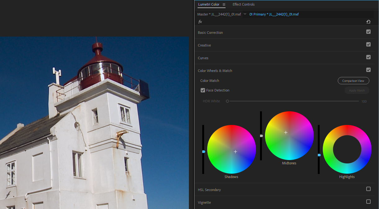
Color Wheels
Color wheels are probably the first thing that comes to mind when you think about color correction. This toolset allows you to adjust almost everything about an image, including the brightness, hue, and saturation for each of the three tonal ranges (independently or all together). Different software will vary slightly in how they handle color wheels, but the general capabilities are the same.
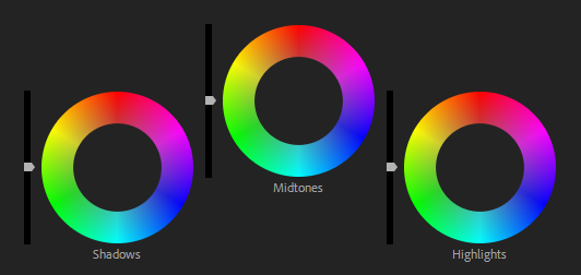
Each tonal range is represented by a wheel. At the center of these wheels is the white point, and at the edges are the primary hues and their combinations. Within each wheel is a marker that you can move to introduce a hue into a tonal range. The further from the center you move this marker, the higher the saturation of the introduced color will be. This makes fixing color balance issues quite easy.
For example, if you think the darkest part of an image could use more red, simply drag the corresponding marker toward the red border of the wheel. Or if you need to neutralize a green color cast in the midtones, you just need to drag that marker a bit toward magenta (remember, colors opposite one another on a color wheel cancel out).
Of course you will also need to adjust the brightness of your image, and color wheels make that a breeze. Depending on the software, there will be a scroll-wheel or slider attached to each wheel that adjusts the brightness levels of each tonal range. If you see that the highlights in your image are clipping, all you have to do is lower the slider/scroll the wheel to bring them down.
This is a very powerful toolset, because it puts nearly all aspects of an image’s luma and chroma at your fingertips. One of the reasons color wheels are so intuitive is because they’re based on the natural ways we think about color (hue, saturation, and lightness). Color wheels can be even more intuitive if you use a hardware control surface. The addition of physical knobs, dials, and wheels allows you to make adjustments in real time without even taking your eyes off the image.

One big thing to keep in mind–there are actually two (or more depending on who you ask) flavors of color wheel, and they control your image in significantly different ways.
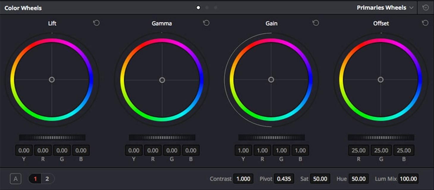
The first type we’re concerned with are called lift/gamma/gain color wheels. These are just alternative terms for the three tonal ranges. Lift corresponds to the darkest parts of your image, gain to the brightest parts, and gamma to the in-between parts.
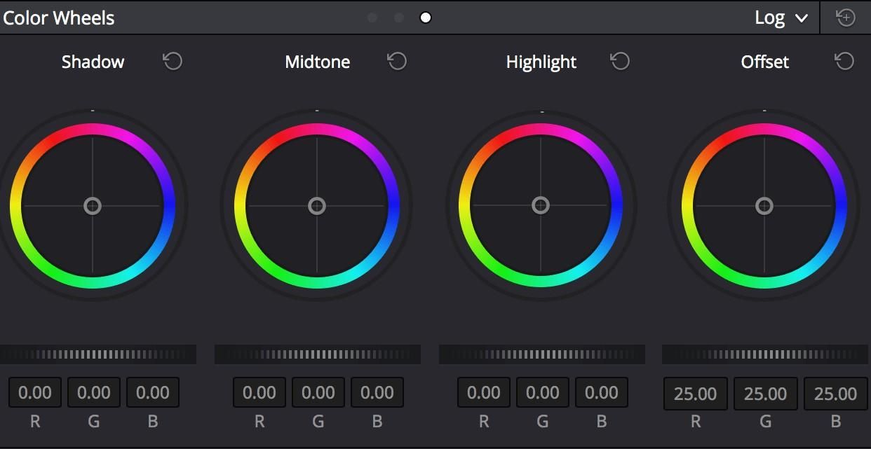
The other type of color wheel is labeled with the terms shadows/midtones/highlights. You can probably figure out what these wheels do based on their names.
These tools might sound like they do the same thing, and to a degree, they do. However, the method these color wheels use is quite different, which means the results they produce can also be very distinct. Why? In short, math.
The methods these different tools use to lighten and darken the different tonal ranges are based on different calculations/considerations for video signals. Neither is “better” than the other, they are just tools for altering your image in specific ways.
Despite the technical difference, many software applications adjust images along the lines of lift/gamma/gain, even if the color wheels are labeled shadows/midtones/highlights (most notably FCP X and Premiere Pro). However, DaVinci Resolve has both types of color wheels, as do other color-specific applications.
It takes a fair amount of experience to really understand the distinct ways these tools differ. However, it’s important to know that a they both exist, so as to avoid confusing mistakes when using different software. They may look almost identical, but they are most certainly not the same.
Curves
The Curves tool allows for fast and precise image adjustments in a single, visually-intuitive interface. With curves, you can make subtle tweaks to a single clip, or drastic changes to an entire sequence.
But it’s not just highly versatile, it’s also universal. The basics of editing with curves are the same no matter which program you’re using. This makes curves a powerful color correction tool for practically any workflow.
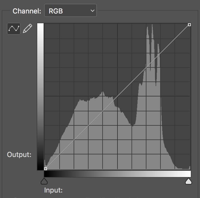
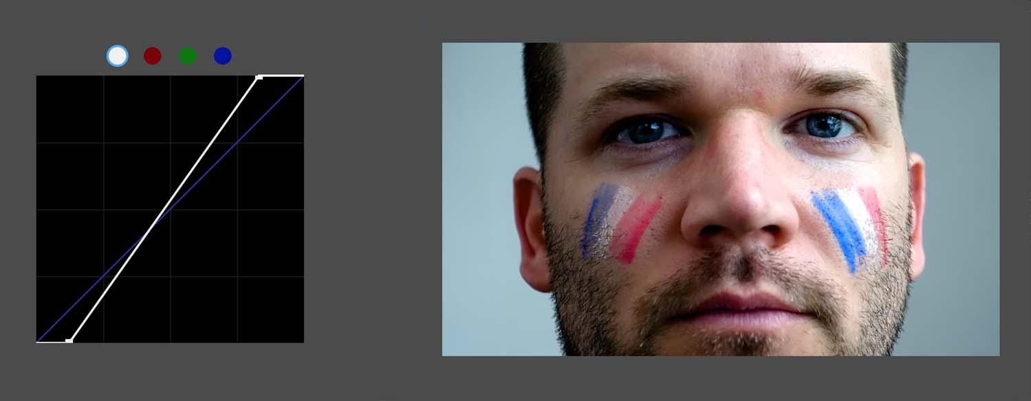
Upon opening the tool in your software-of-choice you’ll see a straight, diagonal line inside a square box. There might also be a histogram, a grid, and maybe a few sliders at the bottom, but not every program will have these. At this point, you might be wondering, where are the curves?
This is a bit of a DIY tool. You have to make the curves yourself. At first, this might seem confusing or intimidating, but it’s really quite simple and very powerful.
Essentially, the diagonal line represents the range of brightness values in an image. The bottom-left endpoint of the line represents the darkest point in an image, while the top-right endpoint represents the brightest point. The line segment between these points is the transition from one extreme to the other, from absolute black, through the midtones, to absolute white.
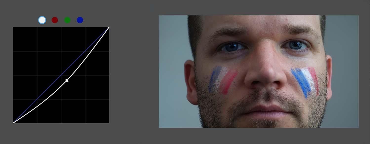
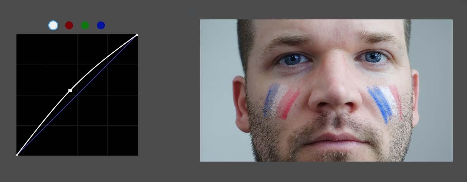
To adjust an image with the curves tool, all you have to do is add a point to the diagonal line and then make a curve in the line. Curving it upwards will brighten the image, while curving it downwards will darken it. If you add multiple points, you can adjust the image in multiple ways.
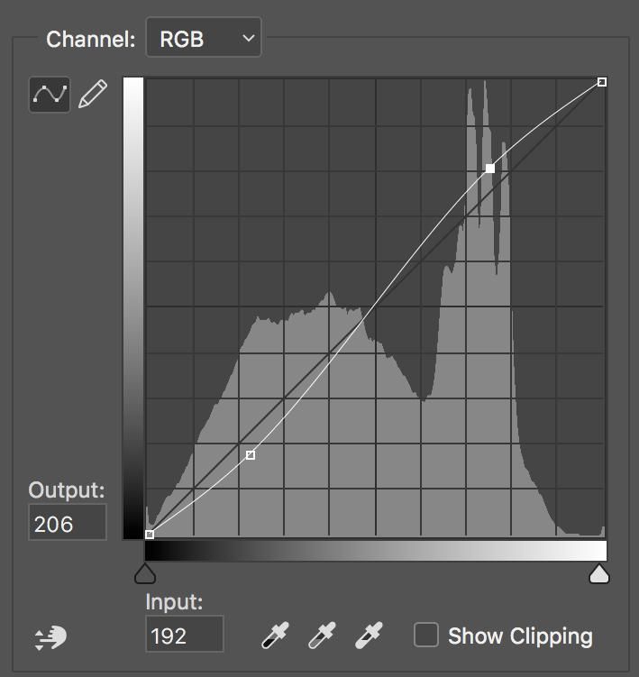
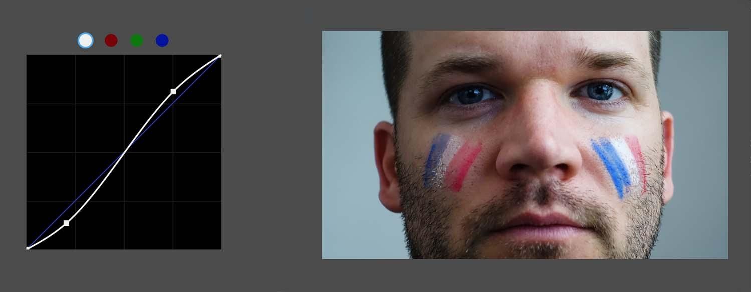
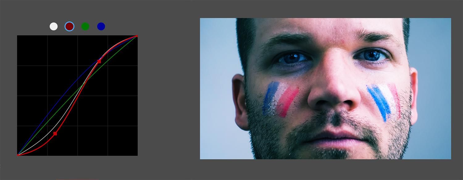
In this example, the medium-shadows in the bottom left have been darkened slightly with a new point. The medium-highlights in the top right have also been brought up with a point. By darkening the shadows and brightening the highlights, we have essentially increased the contrast of the image.
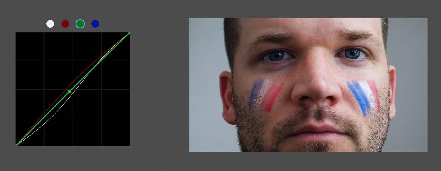
This layout gives you a plethora of options for adjusting luma values across the tonal range of your image. But you can also control the three primary color channels in curves.
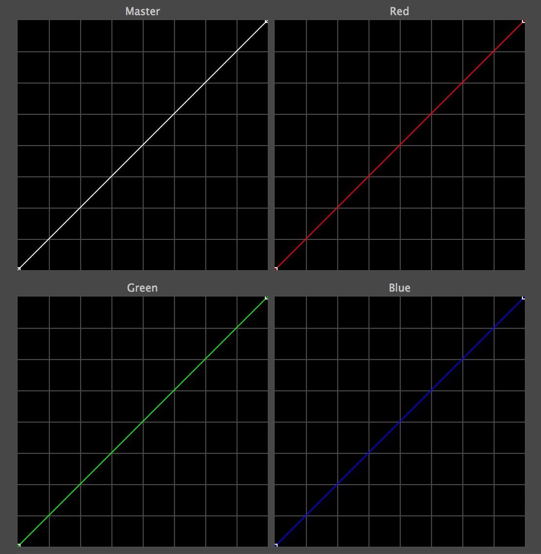
The capability to adjust the color channels individually enables you to balance balance, match shots, and craft a stylized look all by adding points to a line and bending it.
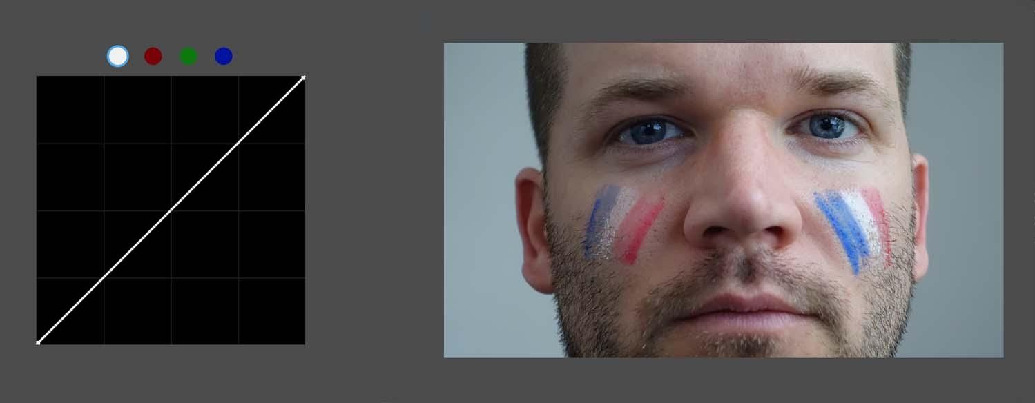
But how exactly will bending the line change an image? Let’s take a closer look at what exactly the curves tool can do using this image as example.
Remap White and Black Levels
As we learned earlier, the left endpoint of the diagonal line represents the black level of an image, while the right endpoint represents the white level. You can remap these by moving them in toward the center. This has the roughly same effect as expanding the range of gamma in the color wheels.
Darken the Image
Should you need to darken part of your image, you can achieve this by adding a point to the line and then dragging downwards. The further you bend the line, the darker the image will become. If the point is in the middle of the line, this is roughly equivalent to lowering the gamma in the color wheels.
Brighten the Image
If you need to increase brightness in your image, then that can be achieved by doing the opposite. Adding a point to the line and bending the curve can upward will lighten your image. If the point is in the middle of the line, this is roughly equivalent to raising the gamma in the color wheels.
Add Contrast
If you need to add contrast to your image, you can quickly do this with the popular S-Curve (as illustrated earlier). The S-curve is popular due to its simplicity. All you need to do is add two points on the line—one toward the lower end of the line and the other toward the upper end—and then drag them them in opposite directions. With the lower point creates darker shadows, and the upper higher point boosts the highlights.
Adjust Color
Once you have a handle on what bending the line does to your image, try adjusting the three color channels in a similar fashion. See how adjusting the highlights, midtones, and shadows of any of the three color channels impacts your image. Understanding these effects is key to using RGB curves to color correct your project.
Match Shots
When paired with the RGB Parade scope, curves is a quick and intuitive way to match color between shots. With the scope up, you will be able to see how the color channels are balanced (or not), and then make subtle adjustments between them with curves. Whether you need to smooth out skin tones, remove a color cast, or just add a little bit more saturation, RGB curves and the RGB parade make shot matching pretty easy.
Each of the above examples is easily achievable with the RGB curves tool. But these are just some of the possibilities, and indeed there are other curve tools available, like the Hue vs. Saturation Curves tool.
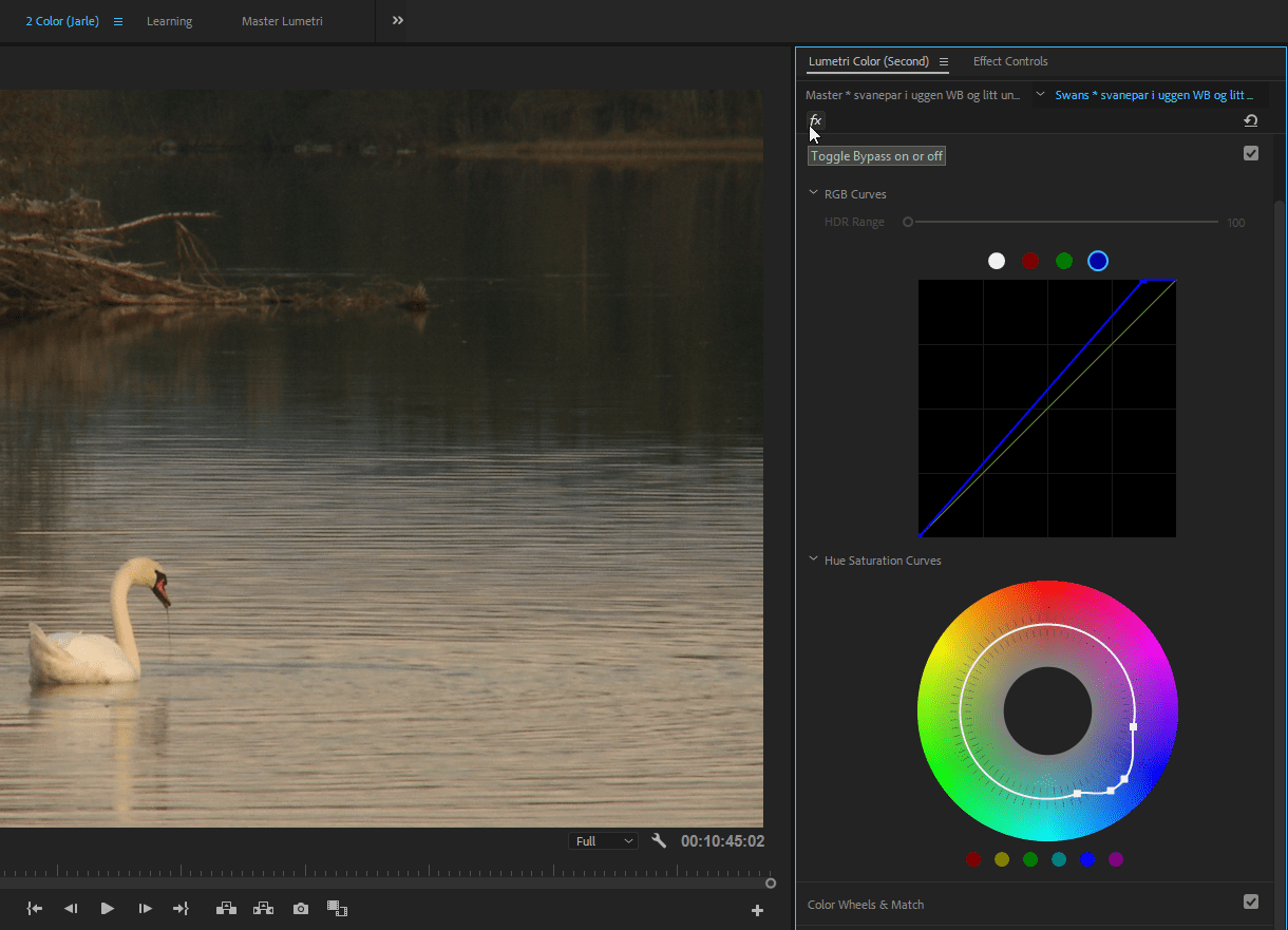
Unlike RGB curves, this curve is often displayed as a circle, so when you add points to the line, you drag them closer or further away from the middle. This gives you independent control the saturation of each of the primary colors in the color wheel.
There are also more advanced curve tools like the Luma vs Saturation Curves, the Hue vs. Luma Curves, and several others. While you can certainly cover the vast majority of the color correction process with just the RGB and Hue vs Saturation curves, the advanced curves enable even finer artistic control. Once you have a solid understanding of the RGB curves, you should explore the more advanced tools.
Continue readingfor free
Unlock all 100,000 words of the Frame.io Workflow Guide and learn how the pros do workflow.
