Color
Color Correction Suites
13 minute read
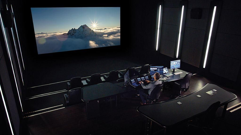
Professional color correction suites are an almost mythical domain to many who peek in from beyond their secluded walls. Huge DI grading theaters seem like the ultimate luxury, with enormous displays, cushioned chairs, perfect mood lighting, and oh so many buttons and knobs. These high-dollar tools look the part, and if you’re passing off your project to a dedicated colorist, they probably fill you with confidence (otherwise you wouldn’t be paying for it).
Newer filmmakers might think that such tools are beyond the reach of mere mortals. It is possible, however, to achieve quality color correction on a reasonable budget. If you are handling the color work of your project in house, you should consider building out a dedicated workspace for this task.
Of course, filmmakers planning to build such a workspace need to learn how to use the necessary hardware tools, but they must understand the basic requirements of a color-focused working environment. Such considerations will help maximize the results of your color work.
The Suite
The first thing to understand is that the color suite is a specialized, highly-controlled environment built for a very specific purpose—to work with color as efficiently and precisely as possible. This purpose brings with it special requirements that will not make as much difference for other parts of a post-production workflow. That means that building out a color correction suite is a significant investment that really only fulfills a single function. Before you get started, you need to determine if such an investment will pay off for your project/workflow.
Assuming that it does, the first task is to identify your actual workspace. Color grading suites can be almost any size or shape, but your post-production context will dictate exactly what you need. If you’re planning on having 10 or more clients in the room to review color, then you will need a large space akin to a small theater. But if you only plan on having 1 or 2 reviewers in the suite at any given time, then a nominally-sized office should do just fine.
There is also the option of setting up your suite for remote color correction, where clients are not actually in the room with you, but are at another location following along. This is a more advanced type of suite, but can be tremendously useful for workflow that stretch across the country or the globe.
Contributed by Charles Haine, Filmmaker, writer, host and professor.
Light
Once you have your space selected (or constructed), your next task is to control all ambient outdoor light. This control is the first, fundamental step in creating a color correction suite. Any stray light that enters the suite is a problem. Even if it doesn’t hit your screen, ambient light influences your perception of color, because it changes throughout the day. That means your eyes and brain will naturally adjust without you knowing it, which will influence how you see the colors in footage.
To gain control over ambient light, many color correction suites are located in the interior of buildings, with no windows to the outside. This prevents any sunlight from leaking into the room, with is great for ensuring consistency in your work. However, this lack of natural light exposure can have a negative emotional/physiological effects if you are working in it for most hours of the day, so be sure to still go outside every once in a while. Should you choose to use a room with windows, make sure you have substantial blackout curtains to block out as much sunlight as possible.
Once you have complete control over ambient light in your suite, it’s time to add your own. Every bulb in your suite should be balanced to a 6500k color temperature. This balance corresponds to the D65 white point of your computer monitor, which will prevent your eyes from adjusting to an off-colored light source. You also need to make absolutely sure the bulbs have a high Color Rendering Index (CRI), of at least 90. The higher the CRI of a lightsource (up to 100), the more accurate colors will appear under their illumination. In general, it’s a good idea to make sure all the bulbs/fixtures in your suite are the same model, to eliminate any inconsistencies in your light source.
When it comes to light placement, it really comes down to preference. The only hard requirement is to ensure none of your lighting pollutes your picture. Other than that, you can distribute them around the suite as needed, to make sure other tasks (like walking around or reading) are not impeded. Dimming is a useful feature, but you will need to buy lights with this capability (not all CFLs and LEDs can dim). On top of that, make sure the dimming function is high-quality, and does not produce a visual flicker or audible buzz, both of which can seriously degrade a working experience over long hours. Some lights will even change color when dimmed.
Paint
The final step in building your color correction suite is to establish a neutral color environment. How do you do that? By painting the walls neutral gray, specifically 18% gray or middle gray. The name of this color is derived from it’s position on CIE lightness scale, roughly halfway between absolute black and white. The “18%” refers to the amount of visible light this color reflects. The reason this gray is necessary is that it keeps your perception of color constant. If your walls were bright yellow, your eyes would compensate somewhat without you knowing, and you wouldn’t see yellow in your footage quite as much. That might mean your actors come out looking a bit like bananas, which your client might not appreciate. So, gray walls serve as a neutral point on which your eyes can establish a baseline of color and brightness.
This paint can in some cases be mixed at a local store, but the results are not always consistent or accurate. The best option is to order the paint from a specialized manufacturer. Keep in mind this paint can be very expensive (~$80 per bucket), but the results are difficult to match. However you source your paint, get a sample and test it in your suite. Once you have selected a paint, any wall that is in your view (including your peripheral vision) while you work needs a coat.
Once all of this is done, your suite will be a conducive environment for color correction work. Now, you need to fill it.
The Screen
The first thing you will need in your suite is a viewing device. The screen, monitor, or projector you use is the digital window into your creative world of color. Just like real life windows, some are clearer than others. If you want to see your color work as clearly as possible, you need to make sure your window is as good as possible. There’s really only one way to keep this digital window clear: calibration.
Calibration
Serious color correction requires proper calibration. Without it, the visual style of your film might not turn out the way you want it. A character’s skin might look sickly, or a scene might cause an unintended emotional response from audiences. But a lack of calibration will cause issues before the project is even finished. If a shot is viewed on seperate, uncalibrated machines, there’s not really a way to know which is displaying the image correctly, so it’s impossible to make creative or technical decisions.
As we covered earlier, the colors that your computer outputs are just digital values. It sends them over a cable to your screen, which then reads those values and does its best to produce them. But your computer can’t really “see” the colors that your display is outputting, so you might perceive a different color from the computer is trying to show.
Calibration fixes this issue by cross-checking the display’s color output against known values. If a color value is being displayed incorrectly, the computer will be able to detect it and adjust the color settings of the monitor to compensate.
The most common color calibration tool is known as a probe. These are usually small hardware devices that connect to your computer, and then attach to or rest on the surface of your screen. The computer will run a test pattern (usually included in the probe’s accompanying software) that the probe measures as it is displayed on the screen. As the results are analyzed, the color calibration software will adjust the gamma and color gamut output within the monitor’s color profile. Some color calibration software allows the user to choose the color standard, like sRGB, Adobe RGB, or DCI-P3.
Some of the most popular external color calibration probes are manufactured by X-Rite and Spyder. These probes are relatively cheap, so they should fit into most any budget. Even if they were several times more expensive, they would probably still be worth the investment. You will often see monitors advertised as being factory-calibrated, which can be helpful, but it’s still a good idea to invest in a calibration device. Monitors drift over time, so it’s essential you have a way to re-calibrate them. However, this doesn’t mean you always need an external calibrator. Some high-end professional displays have integrated calibration sensors. These units are pricey, but for certain workflows they may be worth it.
Display technology
Now, just because a monitor has been calibrated does not necessarily mean it is the best choice for your color work. There are many other factors to consider. Fortunately, display technology keeps advancing at a tremendous rate, yet prices continue to fall. There are a few technical specifications that you should look for in a display for your suite.
First, you will need a display with a suitable resolution. In general, you should aim to display your footage on a screen of the same resolution. If you try to grade 4k footage on a 1080p screen, you will have to fight against downsampling artefacts. And if you try it the other way (HD footage on a UHD screen), you that can introduce other issues. This is because the methods for upscaling resolution differ across display equipment, and so things may not always look exactly the way they should. If you do need to color footage that is lower resolution than your screen, it is a good idea to only display it at 100% resolution without upscaling. It is best to select a screen that matches the resolution of your most common footage.
Other than resolution, you need to consider contrast ratio. More is generally better, and you should aim for a display with as high of a contrast ratio as you can afford. For serious color work, 1000:1 is widely considered to be a minimum. However, if you plan on working with HDR content for an HDR delivery, that minimum will increase drastically.
Along the same lines, you should aim for a display with the deepest black levels and widest color gamut that your budget allows. In the past, plasma screens produced the darkest, richest images, but this technology has become antiquated. The newest high-performance screens use OLED technology. These displays are expensive, but their visual capabilities are remarkable. That said, there are tradeoffs to using an OLED screen, like image burin-in. Not only that, but new technology is entering the display market every year, so it probably won’t be long until there is something better.
The final technical specification you should aim for is a 10-bit display This will give you a lot of flexibility in working with your footage, as your display will be able to produce many more colors than more common 8-bit panels (over a billion versus ~16 million). There are also 12-bit displays available, but they are hugely expensive, and require additional, complex equipment and adherence to technical standards that few workflows can handle.
Beyond these broad specification, you will have to choose the actual type of display that fits your workflow needs. If you’re grading for cinema, you’ll want to grade on a projector. But if you’re grading for web, you can just use a computer monitor. It’s always a good idea to see what your image will look like at its intended destination. That will help you make sure everything turns out right. For example, if your project is headed for broadcast, then you should have a TV in your suite that is conformed to Rec.709. This will give you the most accurate representation of how viewers will encounter your work.
The same concept applies to bit depth. If you know that your content will only ever be viewed on YouTube (which will definitely be 8-bit), then it’s actually best to monitor it in 8-bit.
Once you have a display in your suite, there are a couple of ergonomic factors that will influence your color correction. The first is your display’s brightness. In order to conform to SMPTE standards for a color suite, you should set your monitor to about 25% brightness (as measured by a light meter with the screen showing pure white). This level of brightness will be just enough to see your immediate surroundings in the suite, but low enough that your screen doesn’t produce too much ambient light.
Depending on the size of your suite, and the distance you plan to sit from the screen, you will have to decide on the size of your display. A common rule of thumb is to measure your eyes’ distance from a screen’s position, and then divide that measurement by 3. This number is the vertical height of the monitor that is recommended for that distance. For example, if you sit ~4 feet from your display, then a 30 inch display is recommended. In theory, this will give you a full view of the image, but without too much eye strain. However, these are just guidelines. Your exact ergonomic preferences should be the deciding factor.
Following these recommendations will give you the best results for viewing your images. The final step is to equip your suite to manipulate that image.
The Control Surface
Any professional colorist will tell you that the fastest, most efficient way to manipulate an image is with a hardware control surface. A serious color correction suite will feel incomplete without one. While you can certainly achieve excellent results using just software controls, once you’ve made the effort to set up a dedicated suite, there’s really no reason to skimp on this final investment.
That said, control surfaces can be a big investment. DaVinci’s full control panel costs $30,000. And there are actually even more expensive options. But you don’t have to spend a new-car’s-worth on color control hardware. Over the last decade, a number of affordable systems have come to market, with some costing only a tenth of DaVinci’s full board. There are even some options (with fewer features) that only cost a few hundred dollars. Of course, the tradeoff is between price and capability. More expensive tools give you more creative and technical control.
You might be wondering what these capabilities are. Well, to start with, a control surface controls the tools of digital color correction–brightness, hue, saturation, tonal ranges, secondary qualifiers, and vignettes. Pretty much any parameter of an image can be adjusted with a control surface. That’s why there are so many buttons, dials, knobs, and trackballs. Each one does a specific thing. And this is no coincidence. The software tools we use for color evolved to mirror the hardware controls. These tools were originally made to be manipulated by hand, but as software advanced, they were adapted for the mouse and keyboard.
So, naturally given the origin of these tools, it’s easy to see why color correction benefits from a physical toolset. Tactile controls allow for intuitive operation, and helps the user develop precise muscle memory. Of course, if you are used to a hardware control surface with trackballs, then software color wheels will make perfect sense to you. But, you won’t be able to work with them as quickly simply because a mouse is not a trackball.
The main benefit of a hardware control surface is speed. Instead of making individual adjustments one at a time, you can adjust as many settings as your fingers can reach. When multiple corrections interact together, you can play with them and explore their influence at the same time. With your hands resting over two color wheels on the board, you can adjust brightness, saturation, and hue for two separate tonal ranges are the same time. Such a feat is not possible with a mouse. And with enough practice, you can make almost any color adjustment without ever taking your eyes off the image. That saves time, which saves money. So, depending on how often you are color-correcting footage, a control surface could have a strong return on investment.
But we also need to consider the soft-return of such an investment. Whether it’s right or not, clients now associate control surfaces with serious color work. If they see you using one (and using it well), they will perceive you to be as skilled artist worth their repeat business. This is not to say that you can’t keep clients if they see you use software tools (obviously that’s not the case), but many clients will have a higher regard for tools they are not familiar with. After all, those mechanical buttons and switches look very fancy to people who don’t understand what they do.
At the end of the day, a control surface is just another tool. If you know how to use it, you will be able to color your project faster and more accurately. But, it’s an advanced tool that will only really add value if your workflow (and skillset) can utilize it.
Continue readingfor free
Unlock all 100,000 words of the Frame.io Workflow Guide and learn how the pros do workflow.
